UI Redesign
We're Not Really Strangers Online Experience Evolution
by Wenge Wang, Yeatasmin Shiropa, Cici Lin, Dominique Dorvil
Project Overview
In this project, we undertook a redesign initiative for the 'We're Not Really Strangers'
website, a brand specializing in card games designed to foster deeper connections between
individuals, whether in friendships or relationships. With the brand's core mission of
facilitating meaningful interactions in mind, we conducted 11 comprehensive unmoderated user
tests to pinpoint areas for improvement and provide tailored recommendations to enhance
usability and engagement, fostering deeper connections with users along the way.
Date
Feb, 2023
Tools
Figma, Google Sheets, Google Form, Google Slide
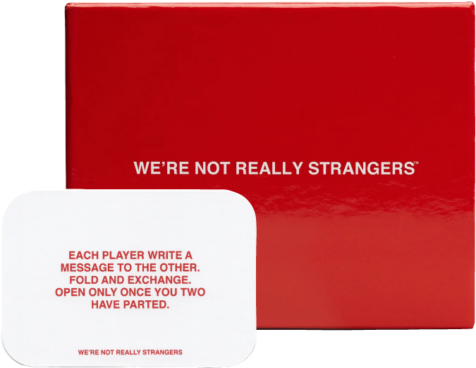
What is 'We're Not Really Strangers'?
"We're Not Really Strangers” is a brand that sells ard games
meant for people to get to know each other better on different levels (friendships, relationships, etc).
The intention behind the brand is for players to forge meaningful connections with others.
The brand blew up on social media and are catered to young adults. Their online website allows users to
shop games and other merchandise, play quizzes, and download free games.
Who are the Users?
The product's users encompass a diverse spectrum of individuals, all driven by a shared desire for deeper connections with others. Central to their values are emotional intimacy, self-awareness, and empathy, shaping their interactions and relationships. These users embrace thought-provoking conversations that foster vulnerability and self-discovery, reflecting their openness to meaningful engagement and personal growth. For clarity, I built a mind map outlining their characteristics and perferences based on four metrics.
Why Redesign?
We conducted 11 unmoderated user testing sessions on UserTesting, targeting young students and simulating a college freshmen social party environment to mimic real-world interactions. Each participant was given five main tasks and questions aimed at understanding their preferences, expectations, and pain points within the context of the product or service being tested. By analyzing videos from participants who recorded their experiences on the website and performed the tasks while 'thinking aloud' in their own environments, we identified several key findings, indicating areas for improvement.
❶ Go to We're Not Really Strangers homepage and browse without clicking.
❷ Look for what the brand is about to learn more about it.
❸ Based on what you saw on this page, how would you describe “We’re Not Really Strangers” to a friend?
❹ Would you visit this website again?
❺ How easy or difficult was it to explore the navigation bar?
Found Site's Purpose Off-Task
Users found it easy to learn about the site's content, but this understanding was not achieved through tasks intended to define the site's purpose.
Encountered Visibility Issues
Users found it difficult to find the free downloaded games.
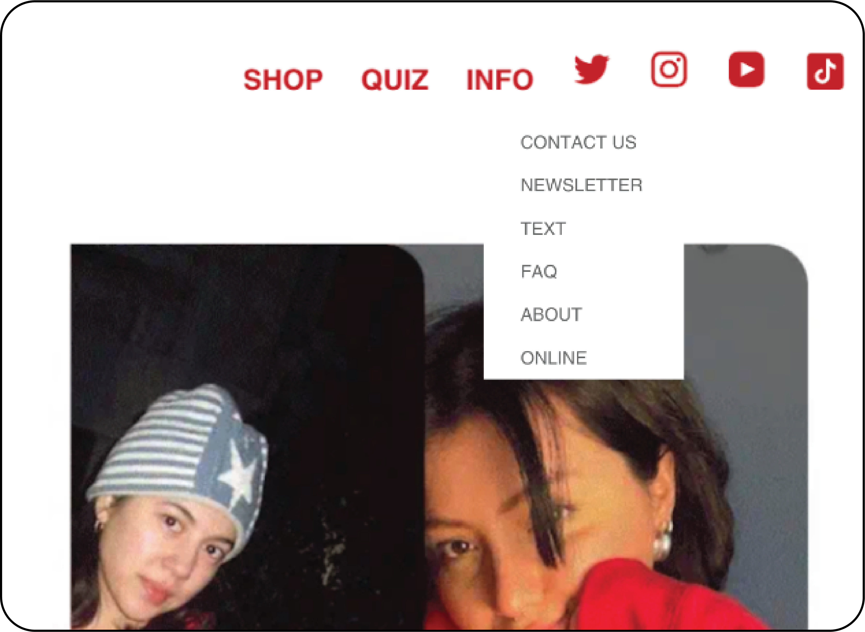
Recommendation 1: Clearer Navigation
User Issue: Users have a difficult time finding free games. Many users were confused about labeling and mentioned they weren’t clear, and that size was an issue.
Solution: Fix Navigation Bar. Rename “Quiz” & “Online”, put under new tab “Online Content”, enlarge, and move social media icons to footer.
See what the users say ⤵
"I wasn't able to find able to find a free game."
"I didn't really know what the online tab was for. it's like a little bit vague, online can mean anything."
"Maybe if it could be a bit bigger so that people could see it more clearly, it would be easier to explore."
"The place where it (the downloadable game) was in the online section was a little hidden.."
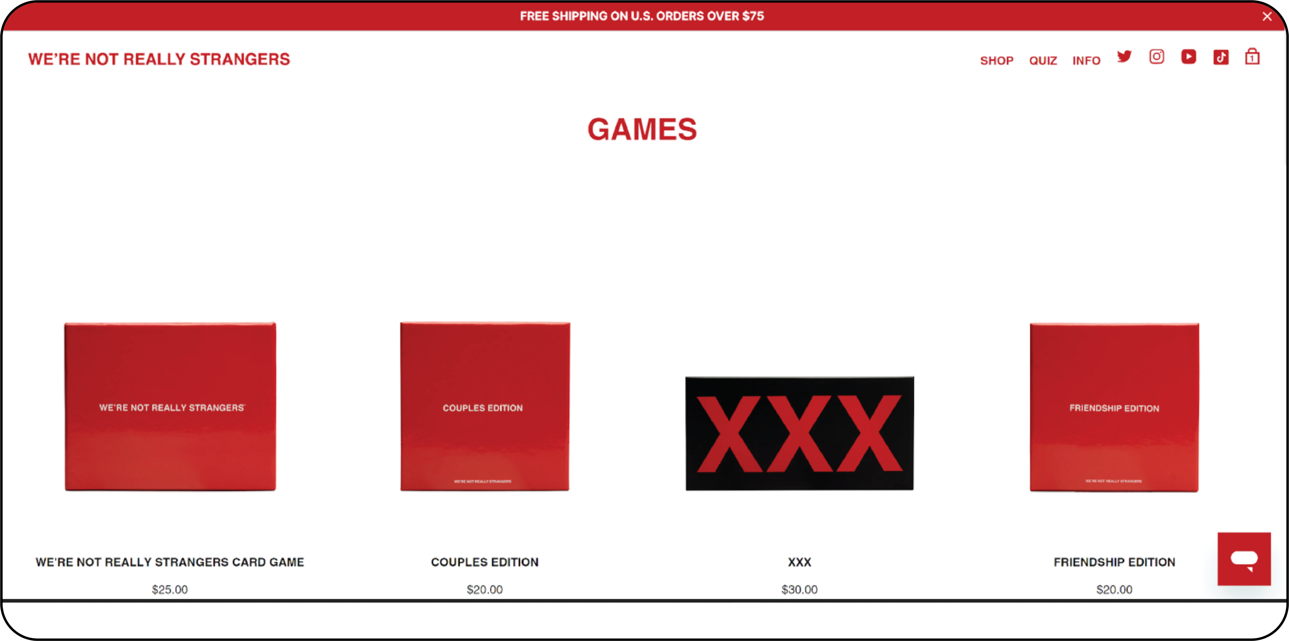
Recommendation 2: Add Filters to “Shop” Pages
User Issue: Users face difficulties when attempting to apply filters to shop items on 'Shop' pages, such as those found in the 'Games' section.
Solution: We added two filters. The first filter bar helps customers to find games based on specific categories, and the second filter bar is based on different criteria such as default, newest, trend, and price.
See what the users say ⤵
"It's really hard to find what you're looking for."
"Some things you can't find and then you have to look for it for ages."
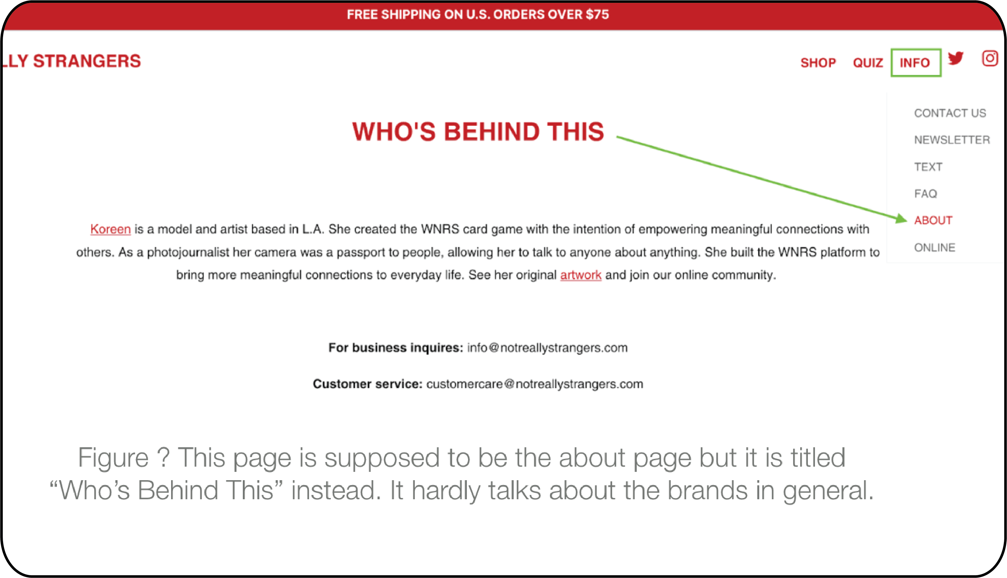
Recommendation 3: Improve Information Clarity in 'About' Section
User Issue: "About" section is not clear enough for users to fully understand brand and mission. This lack of clarity undermines the effectiveness of the "About" section.
Solution: Add more information to “About” section and add “About” as a title to match navigation bar labeling
See what the users say ⤵
"It's really hard to actually find the company's mission."
"I would say it seems like a dating app but it's about card game."
"I think that needs to be defined a lot more because I was confused."
Conclusion
“We’re Not Really Strangers” does a good job of setting a tone for their brand and appealing to their audience. However, locating certain things were difficult or hidden, which lead to the few changes we made to improve the site’s navigation.
Using the methodology of user testing allowed us to received feedback that provided direct visualization of user navigation and how participants interpreted our tasks and the website.
We would like to extend our gratitude to competitors "What Do You Meme" and "Cards Against Humanity" for their inspirational contributions and insights, which have greatly enriched our understanding of this industry.
Finally, it's important to note that these testing sessions and recommendations were conducted in February 2023, so there may be differences from the current state of the website.
Reflection
Change our questions for participants to understand better. We noticed the users interpreted the questions differently than what we intended which distorted some of the results. For example, only 18% of participants said the navigation was easy to use despite 100% of participants having issues navigating the website. Also we could have explained what a navigation bar is because almost all of our users did not know what a “navigation bar” was.
Ex: How easy or difficult was it to explore the navigation bar?
What we should have said: How easy or difficult was it to use the navigation bar (page’s menu buttons in the upper right corner) to help you solve your tasks.
One of our tasks were really hard to find because the navigation on the site is so poor. So in our task, we should have clarified that the task is able to be done because many of the participants believed that task wasn’t done on the site.
Ex: Find and download a free game that you and your friends would enjoy.
What we should have said: There are free games on this website. Please find the free online editions (download optional). Downloading only pops up another page.